How carbon pollution spread across the Earth
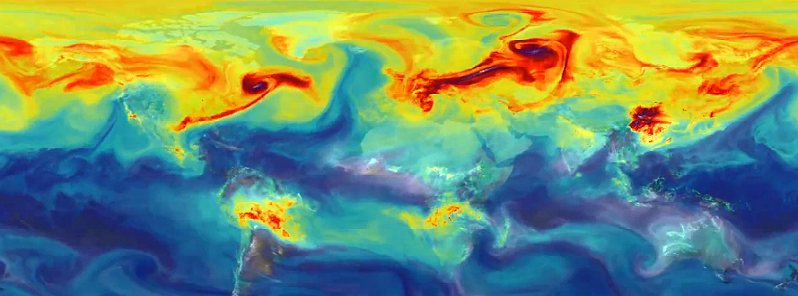
New video released by scientists at NASA Goddard's Global Modeling and Assimilation Office reveals how the greenhouse gas carbon dioxide in the atmosphere travels around the globe in a single year. The results focus on a period between May 2005 and June 2007. At the time, carbon dioxide concentrations in the atmosphere ranged from 375 to 395 parts per million. In the spring of 2014, for the first time in modern history, atmospheric carbon dioxide levels across most of the northern hemisphere exceeded 400 parts per million for three months in a row.
Video was produced by an ultra-high-resolution supercomputer model called GEOS-5, which simulates winds, clouds, water vapor and airborne particles such as dust, black carbon, sea salt and emissions from industry and volcanoes. The simulation produced nearly four petabytes (million billion bytes) of data and required 75 days of dedicated computation to complete.
The colors represent a range of carbon dioxide concentrations, from 375 (dark blue) to 395 (light purple) parts per million. The red represents about 385 parts per million. White plumes represent carbon monoxide emissions.
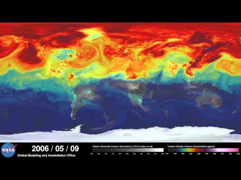
The simulation called "Nature Run" includes real data on atmospheric conditions and the emission of greenhouse gases from both natural sources, such as volcanoes, and human-related emissions, such as those created during the burning of fossil fuels. The model highlights the influence of seasonal cycles and local patterns on the amount of carbon dioxide in the atmosphere.
"Simulations like this, combined with data from observations, will help improve our understanding of both human emissions of carbon dioxide and natural fluxes across the globe." Bill Putman, lead scientist on the project at NASA's Goddard Space Flight Center in Greenbelt, Maryland
Earth's carbon dioxide levels peak in the spring, and then drop in summer, when Northern Hemisphere plant growth absorbs gas from the atmosphere. Concentrations rise again during fall and winter, continuing the cycle. Plant growth in the Northern Hemisphere has a greater effect on CO2 levels than it does in the Southern Hemisphere because there is more land in the Northern Hemisphere.
The simulation also pinpoints the planet's three biggest polluters – the United States, China and Europe.
North American emissions
In this close-up view of North America – from February 1, 2006 to March 1, 2006 in the simulation – you can see the major emissions sources in the U.S. Midwest and along the East Coast. As the carbon dioxide is emitted, westerly winds created by the warm currents of the Gulf Stream carry the greenhouse gas eastward over the Atlantic Ocean.

Asia and the Himalayas
In this view of Asia, two things stand out: the major emissions sources of the industrialized Asian countries, and the natural barrier of the Himalayas. The Himalayas block and divert winds that swirl around the high mountains. East of the Himalayas, these winds pick up carbon dioxide emissions from the industrialized Asian countries and carry the gas toward the Pacific Ocean. This video shows February 1, 2006 to March 1, 2006 from the simulation.

African fires
In the Southern Hemisphere, plumes of carbon dioxide and carbon monoxide rise from forest fires in South America and southern Africa. While the previous movies showed regions of major man-made emissions, this close-up shows the emission of carbon dioxide and carbon monoxide from fires in southern Africa. This video shows August 1, 2006 to September 1, 2006, a period of seasonal burning in this region.

Scientists have made ground-based measurements of carbon dioxide for decades and in July NASA launched the Orbiting Carbon Observatory-2 (OCO-2) satellite to make global, space-based carbon observations.
Explore GEOS-5 Nature Run collection
Out of curiosity (because I don’t know much about this and it’s fascinating), what sorts of natural occurrences would have been omitted and why? I noticed that the volcanic eruption of Mt. Tungurahua in Ecuador on July 14th 2006 didn’t even make a “blip” and if memory serves, it was of significant size.
Thank you for your time.
I claim BS on the results of that simulation, look at the Northern hemisphere:
1) Daily CO2 out from large Cities should be fairly consistent ie you should always see red dots scattered across the country, like LA and New York do but the rest of the country is modeled incorrectly.
2) What is the Monsterous polluter in Canada, you see a huge red wave which blows across the north lat in the simulation, so what is the source you see no source.
3) The simulation does not show accurate sources of the emitters nor does it show an accurate mixing of the source gas with the surrounding non rich gases.
Who made this model? Looks like the modeling of a Computer Wizard College Grad with a new toy, and a huge lack of practical understanding of what the output should look like. A) If you are going to try and prove your hypothesis make sure the resolution of the simulation is accurate enough to capture the required detail. B) Make sure the Output data is believable with regards to your hypothesis C) And most of all slow the simulation down (again increase the resolution) so that an objective observer can draw conclusions from your model.
NASA you Get an F.
Co2 is not pollution , its plant food. The man made global warming hoax ended almost 20 years ago. The earth has now entered a new ice age.